


Meet Solarium
Meet Solarium
Brilliantly recognizable.
Brilliantly recognizable.
Brilliantly recognizable.
Brilliantly recognizable.
An iOS icon pack inspired by light, glass, depth, and highlights.
An iOS icon pack inspired by light, glass, depth, and highlights.
Spec-tac-ular highlights.

A Home Screen worth staring at.
Solarium brings color and character to a wide range of Home Screens, from expressive layouts to quieter, more minimal setups.

Distinct in every shade.
A dedicated monochrome collection preserves the shapes and details of Solarium while adapting beautifully to Clear mode.

Different Icons. One visual language.
Consistent materials, lighting, color, and perspective bring the entire collection together, even as every icon tells a different story.

Designed to shine.
From 1% HSL adjustments to the way light diffuses through glass, every detail was refined to focus on clarity, depth, and balance.
A Home Screen worth staring at.
Solarium brings color and character to a wide range of Home Screens, from expressive layouts to quieter, more minimal setups.
Distinct in every shade.
A dedicated monochrome collection preserves the shapes and details of Solarium while adapting beautifully to Clear mode.
Different Icons. One visual language.
Consistent materials, lighting, color, and perspective bring the entire collection together, even as every icon tells a different story.
Designed to shine.
From 1% HSL adjustments to the way light diffuses through glass, every detail was refined to focus on clarity, depth, and balance.
Process
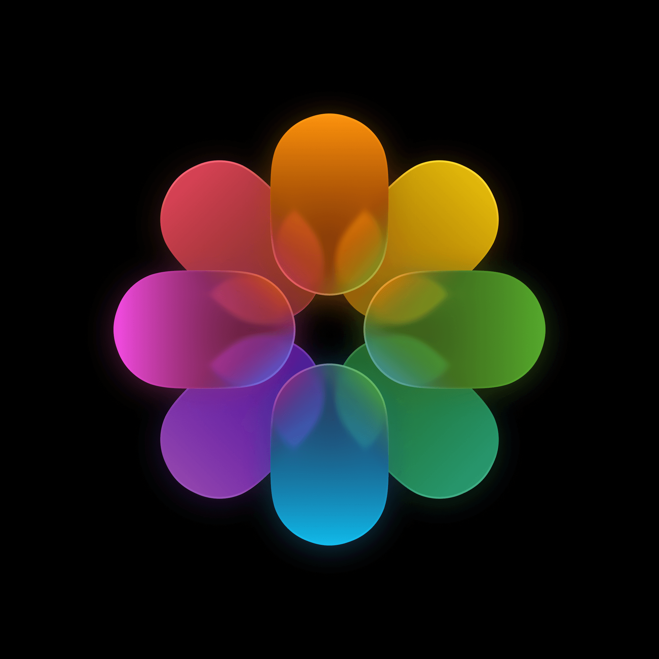
Solarium began as a study of how glass behaves in an interface: how it bends light, reveals what sits beneath it, and creates depth without losing clarity.
We studied translucency, reflections, shadows, refraction, and specular highlights, then translated those qualities into icons that still feel immediately recognizable at a glance.
Solarium began as a study of how glass behaves in an interface: how it bends light, reveals what sits beneath it, and creates depth without losing clarity.
We studied translucency, reflections, shadows, refraction, and specular highlights, then translated those qualities into icons that still feel immediately readable at a glance.
Some symbols feel inevitable because we have seen them for decades. We studied app icon history, interface patterns, and the visual conventions that make familiar objects instantly recognizable.
We questioned which symbols could change without losing what made each icon understandable in the first place.
Some symbols feel inevitable because we have seen them for decades. We studied app icon history, interface patterns, and the visual conventions that make familiar objects instantly recognizable.
We questioned which symbols could change without losing what made each icon understandable in the first place.

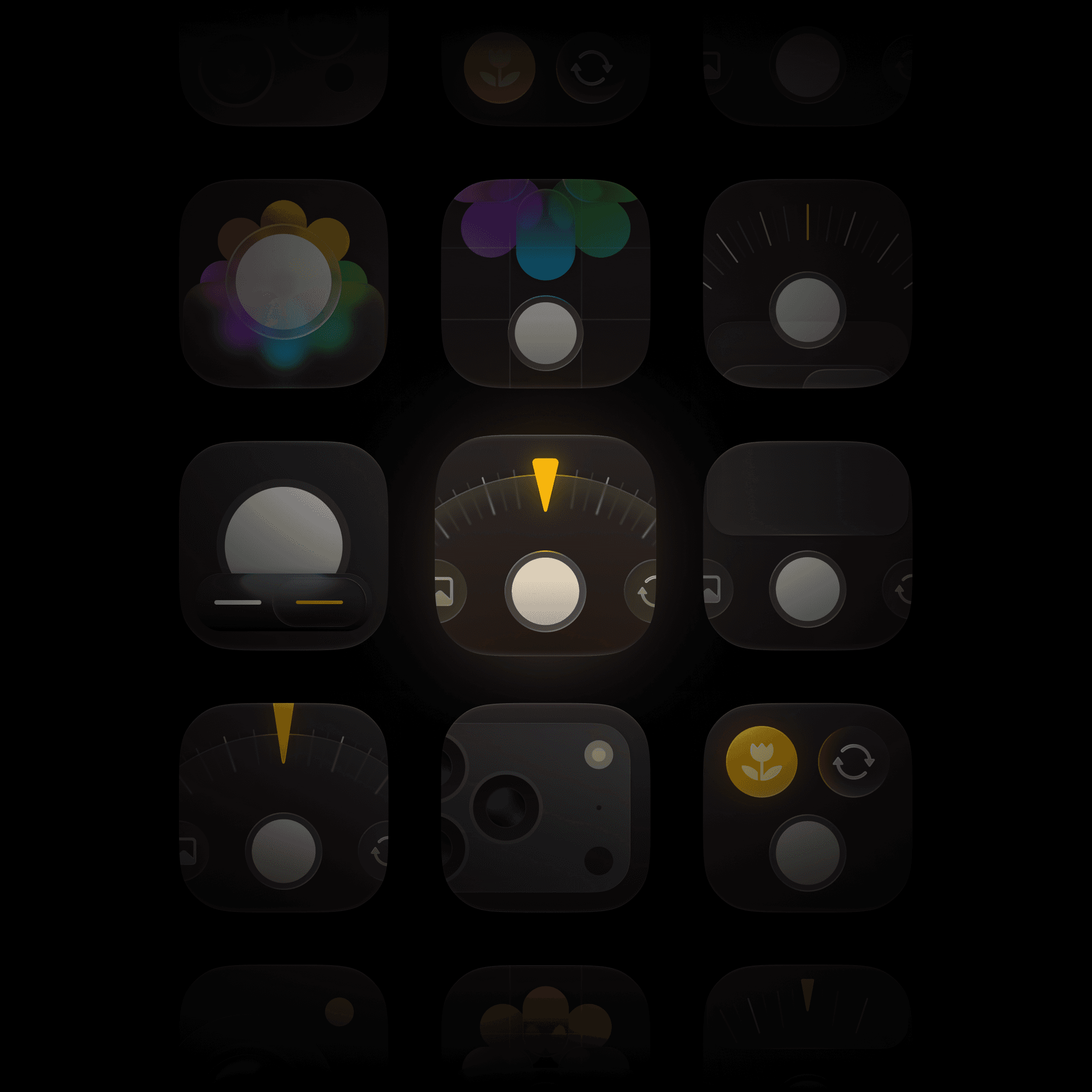
A few ideas came together quickly. Others went through dozens of versions because one curve, reflection, proportion, or patch of color still did not feel right.
We repeatedly rebuilt icons, compared tiny variations, and debated details that most people may never consciously notice. But together, those details determine how an icon communicates.
A few ideas came together quickly. Others went through dozens of versions because one curve, reflection, proportion, or patch of color still did not feel right.
We repeatedly rebuilt icons, compared tiny variations, and debated details that most people may never consciously notice. But together, those details determine how an icon feels at a glance.



Inside the workshop

Behind Solarium


Copyright © 2026 Pedro Lopes and Rohan Tandon.
All rights reserved.